Black and White Photography Wall Art: What to Buy in 2026
Black and white photography wall art turns any wall into a focal point without fighting your existing color palette, and it is one of the easiest upgrades to get right once you know what actually matters before you buy.
- Fotoautomatica and Roam are the strongest black and white photography wall art picks for 2026 living spaces — both are a Buy.
- Size the print to two-thirds of your furniture width; undersized black and white pieces read as accidental, not intentional.
- Canvas softens true black slightly; a fine art print under glass holds sharper contrast, which matters more in monochrome than in color.
- Skip warm gold frames on high-contrast prints — they fight the black instead of framing it.
Why this matters
Black and white photography wall art is not a trend chasing 2026 — it has been the safe, sophisticated choice for gallery walls and single statement pieces for decades, and it still solves a real decorating problem. A monochrome photograph reads as neutral the way a beige rug does, except it actually has presence on a wall that color art can't match without clashing with something.
Kitchens are a good proof point. Gioia Wall Art built a guide to black and white wall art for modern kitchens because that room gets asked about constantly — open shelving, tile backsplashes, and stainless steel all clash with busy color palettes, but a graphic black and white print sits right on top of them without a fight. The tricky part is not finding a photograph you like. It is picking the right contrast level, finish, and size for the room you are actually hanging it in, which is what the rest of this guide covers.
Who this is for
This guide is for anyone furnishing a room in black, white, and every gray between — Japandi and modern minimalist homes where color is already restrained, renters who want art that will not clash with whatever wall color the next place has, and gift buyers who don't know a recipient's palette but know they like clean, editorial-looking rooms. It is also for anyone staring at a beige, gray, or white wall who wants one confident piece instead of a gallery-wall project.
If you already have a strong accent color in the room — a green velvet sofa, a terracotta rug, brass hardware — black and white photography wall art is one of the few styles guaranteed not to fight it. Gioia Wall Art's black and white photography wall art collection leans heavily on travel, café, and portrait subjects for exactly this reason: the mood carries the piece, not the color.
What to look for in black and white photography wall art
Contrast level does the heavy lifting
A true black and white photograph has deep blacks and clean whites, not muddy gray throughout the frame. High contrast reads as intentional and graphic from across a room; low contrast looks faded, or like a bad scan, once it is printed large. Check the preview at full size before buying — contrast that looks fine on a phone screen sometimes flattens out completely at 30x40 inches.
Subject matter should match how the room is used
A close-up portrait or figure study feels intimate and works in a bedroom or a reading nook. An architectural or travel scene feels more public and suits an entryway or living room better. Café and street scenes do double duty in kitchens and dining rooms because they are inherently about food and gathering, which is why they show up so often in that category.
Print finish changes how black actually looks
Canvas has texture, and that texture scatters light slightly, which softens the deepest blacks compared to a smooth fine art print under glass or acrylic. For black and white photography specifically, a lot of the visual punch comes from that full black-to-white range. A framed fine art print or poster under glass will usually read crisper than the same image on canvas, especially in a well-lit room.
Frame and mat choice can make or break the print
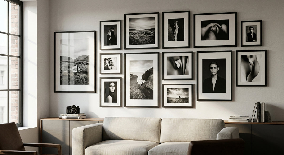
A black frame reinforces the graphic look of the photograph; a white or natural wood frame softens it and reads more gallery-casual. A wide mat, three inches or more, makes even a small black and white print look considered rather than cropped to fit whatever frame happened to be on sale.
Scale relative to your furniture, not your wall
Wall size is the wrong measurement to work from. A print or set should span roughly two-thirds the width of the furniture sitting below it — a 78-inch sofa wants art in the 48-to-52-inch range, not a single 16x20 print that reads like an afterthought above a huge cushion.
Lighting changes everything about how contrast reads
A black and white print under warm, dim bulbs loses contrast and starts to look brownish instead of crisp. Cooler-toned bulbs, or natural daylight from a nearby window, keep the blacks reading black. If the piece is going in a hallway with a single overhead fixture, budget for a small picture light before you commit to a large-format print.
“If the frame competes with the photograph's blacks, the frame loses every time.”
Top picks for black and white photography wall art in 2026
Fotoautomatica — the editorial statement piece
This one reads like a photo-booth strip blown up into art, and it works precisely because it does not apologize for being graphic. It is built for one oversized placement rather than a grid — go 30x40 inches or larger so the strip format has room to breathe on the wall. Hang it in an entryway or as the anchor of a gallery wall where it can hold its own against everything else around it. Buy for anyone who wants a single piece to do all the talking: Fotoautomatica.
Roam — the travel-photography anchor
Roam has the loose, documentary feel of a travel photograph rather than a staged shot, which makes it read as collected instead of decorated. Size it to two-thirds of your sofa's width — on a standard 78-inch sofa that is roughly 48 to 52 inches — so it anchors the seating area instead of floating above it. Buy for open-plan living rooms where the art has to hold a genuinely big wall: Roam.
Still Together — the quiet, intimate one
This is the pick for a smaller wall that still wants presence: a landing, a hallway, a reading nook. At 16x20 or 18x24 inches it does not overwhelm a tight space the way an oversized photograph would. Consider this one for secondary walls rather than a main focal point — it is not built to compete for attention, and it should not be asked to.
Caffe Siciliano — the café-scene classic
A café scene is one of the most forgiving subjects in black and white photography because it stays warm even in monochrome — people, food, motion, steam off a cup. Center it at the standard 57-inch eye-line and it reads right whether it hangs over a breakfast table or in a dining nook. Buy for kitchens and dining spaces, which is exactly why it pairs so naturally with the kitchen wall art guide mentioned earlier in this piece.
What to avoid
- Warm gold or dark walnut frames on high-contrast prints. They fight the black instead of framing it — stick with black, white, or a cool-toned wood finish.
- Low-contrast, gray-heavy reproductions. Black and white photography wall art is supposed to read graphic and bold; a print that leans flat gray looks washed out on the wall, not moody the way it looked in the thumbnail.
- One small print alone on a big blank wall. It reads like a placeholder rather than a decision. Either size up to fill two-thirds of the furniture below it, or commit to a set of two or three instead.
How the picks compare
| Pick | Best Room | Size Guide | Verdict |
|---|---|---|---|
| Fotoautomatica | Entryway, gallery wall | 30x40" or larger | Buy |
| Roam | Living room | 48–52" wide | Buy |
| Still Together | Hallway, reading nook | 16x20–18x24" | Consider |
| Caffe Siciliano | Kitchen, dining | Center at 57" eye-line | Buy |
FAQ
What's the best black and white photography wall art for a living room?
For a living room, size matters more than subject — a piece like Roam that spans roughly two-thirds of your sofa's width will anchor the space better than a smaller print. In 2026, oversized single panels are outperforming small grids in most living rooms.
Is black and white wall art better than color for small spaces?
Black and white photography wall art tends to work better in small spaces because it does not compete with existing color, which makes the room feel less cluttered. A high-contrast piece also adds visual depth without adding more colors to track.
What size should black and white photography wall art be?
Size the print to roughly two-thirds the width of the furniture below it, not the wall itself. A 78-inch sofa calls for art in the 48-to-52-inch range; a narrower console or bed wants something closer to 24 to 36 inches.
Should the frame be black or white?
A black frame reinforces the graphic, high-contrast look that makes black and white photography work. A white or natural wood frame softens the effect and reads more casual, which suits Japandi or coastal-leaning rooms.
Can black and white wall art work in a room full of color?
Yes — black and white photography wall art is one of the few styles that does not clash with an existing accent color, because it has no color of its own to compete with. It works especially well as a visual pause in a room with a bold sofa or rug.
How many black and white prints should hang together?
One oversized piece or a set of two to three is the safest rule for 2026. A single small print on a large wall tends to look unfinished, while a tight cluster of many small prints can look busy in an otherwise monochrome room.
Is black and white photography wall art still trending in 2026?
It has held steady rather than spiked, which is exactly what makes it a safer buy than a color trend that might date fast. Its pairing with Japandi and modern minimalist interiors has kept demand consistent through 2026.
How much does framed black and white wall art cost?
Single black-toned prints on Gioia Wall Art start around $59.99, with two- and three-panel sets running roughly $119.98 to $179.97 as of 2026. Larger multi-panel sets can run higher depending on scale.
One last thing
Most black and white photography wall art mistakes are not about the photograph — they are about the mat. A wide white mat, three inches or more, makes even a modest 16x20 print look museum-quality. Skip the mat entirely, or go too thin, and the same print looks like it came off a drugstore kiosk. If you are only fixing one thing in 2026, fix the mat width before you touch the frame color.