Frida Kahlo Wall Art for Bohemian Spaces: 2026 Buying Guide
Frida Kahlo wall art brings personal mythology, saturated color, and Mexican folk motifs into a room — exactly the ingredients a bohemian space already runs on. The trick in 2026 is picking the right Kahlo piece and pairing it correctly, not just hanging any portrait on a bare wall.
- Frida Kahlo wall art fits bohemian rooms best against warm neutrals and pattern — the self-portrait canvas is the safe buy.
- Skip flat, mass-market Kahlo posters; boho layouts need color depth and texture, not a flattened print.
- Layer a Kahlo portrait with a global-pattern piece like flowing kimono patterns instead of hanging her alone on white.
- Three Kahlo portrait options sit in the current catalog for 2026 — the floral version pulls the most warmth into a boho gallery wall.
Why this matters
Frida Kahlo's face is one of the most reproduced images in home decor right now, and that's part of the problem as much as the appeal. Search demand for frida kahlo wall art sits around 210 monthly searches — steady, not oversaturated the way generic "boho wall art" queries are.
Bohemian rooms already run on visual density: plants, rattan, vintage textiles, terracotta and mustard tones layered on top of each other. A Frida Kahlo self-portrait canvas print adds a human focal point to that mix, but only if the piece itself carries texture and saturated color instead of a flattened poster finish. Buy the wrong version and it reads like a dorm decal. Buy the right one and it anchors an entire gallery wall.
Who this guide is for
This is for the eclectic decorator, not the minimalist. If your room already leans Coastal Luxe or Scandi-neutral, a Kahlo portrait will fight the palette instead of joining it. It's built for anyone layering macrame, plants, vintage textiles, and global patterns who wants one strong human figure holding the wall together — renters filling out a boho living room, apartment dwellers building a gallery wall on a budget, and gift-givers shopping for a friend who names her plants after saints.
What to look for in Frida Kahlo wall art for a bohemian room
Color story that matches boho's warmth
Bohemian rooms run on terracotta, marigold, deep teal, and dusty rose — colors Kahlo used constantly in her self-portraits and still lifes. A print in washed-out or overly cool tones looks like it wandered in from a different room. Check the actual print colors against your existing textiles, not just the thumbnail.
Portrait vs. symbolic composition
Kahlo's catalog splits into direct self-portraits and symbolic floral or still-life work drawn from her garden and folk art. A bohemian layout usually wants the portrait as the anchor and the symbolic pieces as supporting cast around it — not two competing focal points on the same wall.
Print medium and texture
Canvas holds saturated color far better than a flat poster and reads as a genuine art piece rather than a printout, which matters in a style built on texture layering. Museum-quality giclée printing keeps the color depth Kahlo's palette needs; a cheap matte poster flattens that color within a year of window light.
Scale for gallery-wall layering
Boho gallery walls work in clusters, so one oversized Kahlo portrait can crowd out everything around it. The standard sizing rule still applies: wall art should span roughly 60 to 75 percent of the furniture or wall segment it hangs above, and inside a cluster a Kahlo piece should read as one of several, not the whole show.
Framing choice
Skip the glossy black frame — it reads corporate, not bohemian. A natural wood edge, rattan detail, or unframed canvas stretch keeps the piece consistent with the rest of a boho room's material language.
Top picks for bohemian spaces
The icon pick — Frida Kahlo self-portrait canvas. This is the piece most people mean when they search frida kahlo wall art: a direct self-portrait in Kahlo's signature palette of deep red and forest green. It works as a true anchor in a gallery cluster of 4 to 6 supporting pieces. Verdict: Buy this one first.
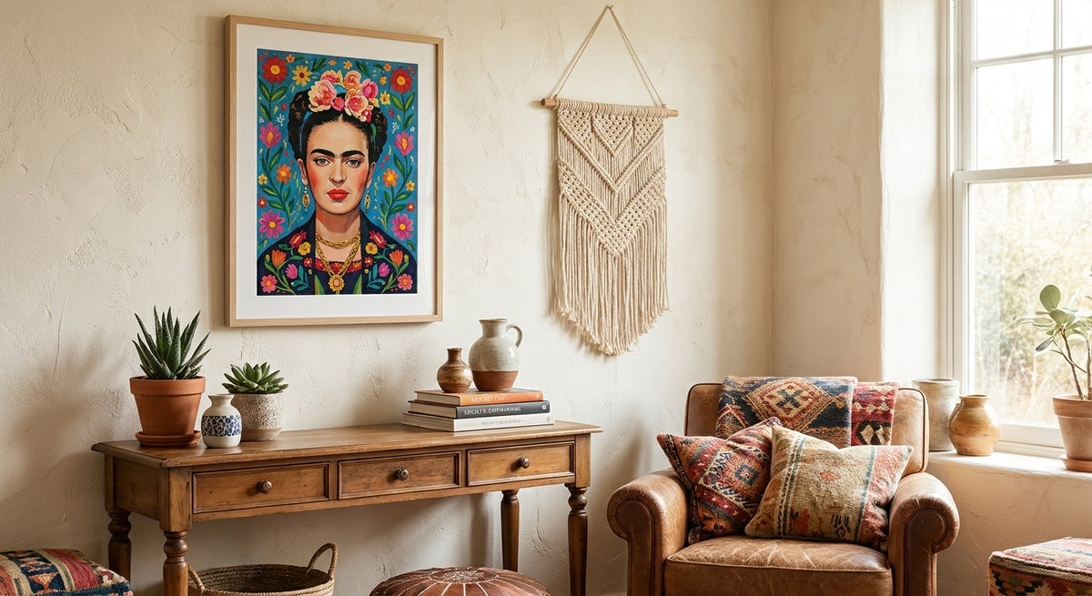
The color-drenched pick — Frida Kahlo floral portrait print. Softer, warmer palette with floral crown detail that plays directly into a plant-heavy boho room. It reads brighter than the standard self-portrait and pairs well with warm afternoon light. Verdict: Buy for rooms already heavy on greenery and warm tones.
The subtle pick — the third Kahlo portrait option in the current catalog. Cooler and more muted than the other two, this one suits a boho room that's already toning down its palette toward neutrals. It won't carry a room on its own the way the two brighter versions do. Verdict: Consider only if your palette is muted; otherwise skip it in favor of the brighter picks.
The pairing piece — Flowing Kimono Patterns. A global pattern print that layers beside a Kahlo portrait without competing for the human-figure spot in the cluster. It brings pattern and color without pulling focus. Verdict: Buy as the second piece in a cluster, not as a standalone.
“Frida Kahlo's self-portraits carry too much color and story to float alone on a plain wall — cluster them, don't isolate them.”
What to avoid
- Motivational-poster versions of Kahlo quotes layered over her face. These read like dorm decor, not folk art, and clash with a boho room's handmade feel.
- Cool-toned or black-and-white Kahlo prints hung against warm terracotta and rattan. The palette mismatch undercuts the whole room, no matter how good the individual piece is.
- A single large Kahlo portrait centered alone on a stark white wall. Bohemian styling wants clusters and layering, not a solo museum-style hang — that look belongs in a different interior style entirely.
The verdict, at a glance
| Pick | Best for | Composition | Verdict |
|---|---|---|---|
| Frida Kahlo self-portrait | Anchor of a gallery cluster | Direct portrait | Buy |
| Frida Kahlo floral portrait | Warm, plant-heavy rooms | Portrait with floral crown | Buy |
| Third Kahlo portrait option | Muted, toned-down palettes | Softer portrait | Consider |
| Flowing Kimono Patterns | Second piece in a cluster | Global pattern | Buy |
FAQ
What's the best Frida Kahlo wall art for a bohemian living room?
A direct self-portrait canvas in Kahlo's signature red-and-green palette works best as the anchor piece in 2026. Pair it with one or two floral or pattern prints instead of hanging it alone.
Is Frida Kahlo wall art too bold for a small apartment?
No, but scale matters more in a small space. Choose a single portrait sized to roughly 60 to 75 percent of the furniture below it rather than an oversized statement piece that crowds the room.
How many Frida Kahlo prints should I hang together?
One Kahlo portrait per cluster works best, surrounded by 3 to 5 supporting pieces in complementary colors or patterns. Two competing portraits on the same wall fight each other for attention.
What size Frida Kahlo wall art should I buy for above a sofa?
Follow the standard rule of covering 60 to 75 percent of the sofa's width with the combined art grouping. A single Kahlo portrait usually anchors one side of that grouping rather than filling the whole span.
Does Frida Kahlo wall art work with Coastal Luxe or Japandi styles?
Not naturally. Kahlo's saturated, symbolic palette suits bohemian, maximalist, and eclectic rooms far better than the muted, quiet palettes of Coastal Luxe or Japandi interiors.
What frame style works best for Frida Kahlo canvas prints?
Natural wood, rattan-edge, or an unframed canvas stretch keeps the piece in line with bohemian material choices. A glossy black frame reads too formal for the style.
How much does canvas Frida Kahlo wall art typically cost?
Pricing varies by size and finish, so check current listings for exact figures. Canvas generally costs more than a poster print but holds color and texture far longer.
Can I mix Frida Kahlo portraits with floral or botanical prints?
Yes, and it's one of the strongest pairings for a bohemian gallery wall in 2026. Kahlo's own work leans on floral and garden imagery, so botanical prints sit naturally beside her portraits.
One last thing
Most people hang Frida Kahlo dead-center on a wall, alone. Try the opposite: put her off-center in a cluster of five, with the smallest piece touching a shelf edge or trailing plant. It reads like considered decor instead of a museum reprint, and it's the difference between a room that looks decorated and one that looks curated.